Wednesday, 16 December 2009
Evaluation
Media Evaluation.
I have created a music magazine which follows conventions of a typical magazine under the genre of Electro pop. I have created a front page, contents page and double page spread all linking with each other and fitting the forms and conventions of the similar products of music magazines. At first I started out working in a group with another girl, but unfortunately that didn't work out, we couldn't decide on the similar images, colour schemes or layouts.
We decided on the genre of the magazine and the name but other than that, nothing matched up so we decided to go our own way and make our own magazines. The person I was working with changed her name of the magazine. I think this was a good move because then we were both able to express our own ideas for our magazines and do it however we liked without having to run it by each other first. We took some images together for our magazines at the start when we worked together but again, they didn’t work out too well, so I went in my own direction and decided to take some pictures of my sister and edit them to look vibrant and attractive to the reader.
When I was planning my magazine I decided to use suitable things on it such as the layouts through out the magazine and the colour schemes to match. I wanted to ensure that I met the acquirements for my target audience; which is within the age group of 16-23 year olds which is a mass market for that age group. I used various popular artists which can relate to the audience as there are many likable choices on there. I used a house style which I made myself which I emulated throughout my magazine, I decided to use bright colours, writing and word use to capture the audience's attention.
I wanted my magazine front cover to look quite crowded, fun and vibrant to reach the target of relating to the electro pop genre.
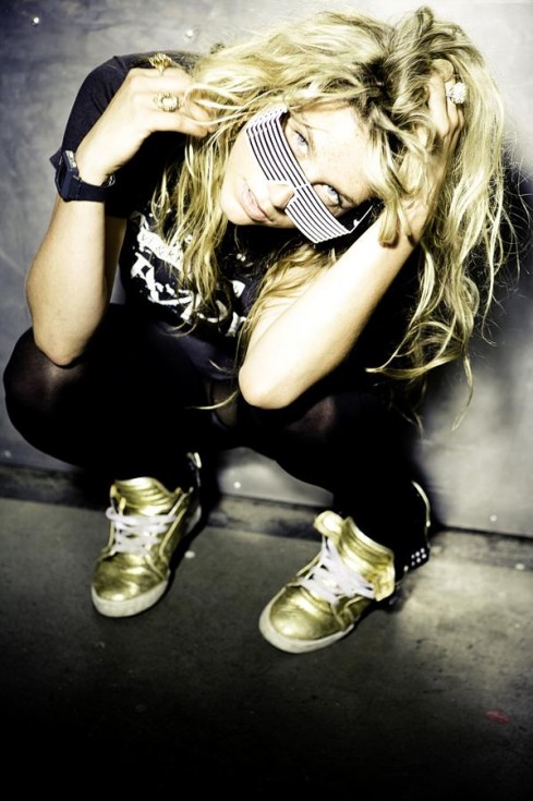
The person I used also will add to the market of the magazine because the costume used for the cover is bright and colourful which reflects the target audience, the electro genre is sort of collaborated with bright colours and themes which include really 'out there' vibrancy and eye catching techniques which, of course catch the audience's attention. The lighting I used for the image on my front cover is artificial average room lighting as it gives a warm feel to the cover which goes with the bright tones of the other conventions of the cover. The pose of the model connotes fun and also matches to the other conventions also the model is looking directly into the camera but is wearing some retro style sunglasses which gives the effect of her looking directly at the audience, but still having some mystery and a typical style to suit the particular genre of which my magazine falls under.
The shot I used was quite close up to her face but still showing her shoulders and a part of her bright clothing, as it grabs the attention much more effectively rather than using a long shot.
The language I used on my front cover is quite informal but to the point. It gives information away that will still make the reader want to look inside and read the articles or see the other features in the magazine. The typography for the cover is simple easy to read fonts, such as Gill sans. I thought this font would work best because its not like the usual, boring ones you see, it is slightly different and looks as though it belongs with my magazine front cover.
The title “CLUB ELECTRO" is the biggest domineering text on the cover so that it stands out as being the title of the magazine and not just a strap line or kicker. Although the kicker about "EMELECTRA" is quite bright and bold, the title is still the main attraction because of the bright red colour and the size of the font. It allows my magazine to be easily spotted on a shelf so it would attract more people to buy it and read it.
My contents page follows on from the front cover as it has the same house style and consists of the same fonts, colours and includes some good imagery of a popular band and some original images I took myself, of two people posing like they are both music artists. I also used an image of T4 on the beach I took, to go in one of the columns where I give some examples of festivals, so the image advertises it.
I divided my contents page into three columns like a usual magazine contents page would do, and I included things which would appeal to any audiences and readers, I added in competitions, gigs and information on new and popular artists. Again, I haven't used any backgrounds for my original images, I just used a white wall which is effective and it also adds to the simplistic but bright and effective theme throughout both the cover and contents.
Emulated from other magazines I have used words such as "gigs" and "festivals" to make my magazine more realistic, I also used "competition" because in magazines there almost always is a competition or two, and I wanted my magazine to be more effective and appeal to the audiences.
The typography is similar to the cover page as I have used the same font and colours in order to keep a recognisable font throughout. For my contents page I have not based the layout on any particular existing magazine, I wanted to make it original but obviously clear that it is a contents page and to be recognizable as one. Like the front cover to the magazine, I have made my contents page bright and busy to follow on and to match. I wanted it to all go together and to be recognizable as one magazine instead having a range of colour schemes and one page that is plain and one that is busy, I wanted it all to be completely matching and clearly continuing from each other.
My double page spread is laid out in the house style of the other pages in the magazine, but I have done it so it is similar to other magazines; I used a picture I took of the model and made it large on one side of the double page spread and added her name, and a quote to make it look like a poster. The wording I have used conveys the atmosphere of the interview. Throughout the images I have taken the costume, the brightness and the makeup stays the same so that the images don't seem to be taken at different times. The images follow the cover and contents pages connotations of young and bright clothing which brings the pages together. The main colour scheme I have used is red, white and blue with also black as the background for the text. Like the cover and contents the language is simple and easy to read as it’s a friendly interview between the "music artist" and the interviewer. The layout represents the social group of 16-23 year olds as it is easy to follow and bold so it makes it stand out above the rest
.
For my magazine I wanted to target a mass market so I could attract as many buyers of the magazine as possible. I have included something for everyone of the age range of 16-23 as they are the ones most likely to listen to the music that is included in the magazine and what it is based on. The places that would most likely distribute my magazine would be anywhere from drugstores such as Boots, or Superdrug, to corner shops and well known newsagents. The people who are most likely to buy the magazine are people who are into electro music, partying and all round having fun, being vibrant and different from other people. This magazine is mostly aimed at females, although it doesn't follow a particularly "girly" array of colours or bands, but it is more populated with female artists and cute guy bands that girls would be into. However the males can also enjoy the magazine as its not strictly aimed at one sex.
To attract the audiences to the magazines, I used bright, bold colours and fonts which make the magazine look interesting and eye catching, I wanted it to stand out from other magazines you would find.
During making my magazine, I have learnt a lot about using the technology, although I was already quite capable and good at using the computer and the photo shop technology, I think I improved on the layouts and what would be suitable to use in the magazine as it has a large range of tools and options. From creating my magazine, I have learnt how to fit the conventions and the general styles of magazines whilst keeping it original with my own, initial ideas. I learnt how to make my magazine as eye-catching as I could, but still enjoyable to look at and read, instead of being blinded by bright colours mashed together, I still kept the colour schemes and some simplicity to my magazine.
From the preliminary task, to make a school magazine front cover and contents page, I have learnt about how to construct a magazine front cover and contents properly and I also learnt why there are certain rules about how many fonts, colours, and images are used so that the cover stands out and isn’t over crowed which could put the readers and audiences off looking at it
Overall I am pleased with the outcome of my magazine, although I was meant to be working in a small group, I think it came out the best it could when I worked alone. I think the colours, fonts, layouts and images all go well together and fit the general conventions of an electro-pop magazine would.
Survery about final magazine.
I produced a final survey questioning people about my finished magazine front cover, contents page, and double page spread.
I asked people to look at my magazine and fill out some questionnaires. I asked;
1) If you were to see my magazine in a shop, would you pick it up and buy it? Does it attract you?
I got some very positive feedback from this question and the people i asked said they would buy it because it is bright and exciting, they also said that the model is very pretty and the images look vibrant and inviting.
2) Would you be able to recognize the genre of this magazine if you saw it in a shop?
When i asked, they said they would because of the colours, the stories and straplines, the layout and the images, also the name is a large giveaway.
3) Looking at the straplines and competitions i have included in my magazine, would they interest you and pull you in to buy the magazine?
Again, i got positive feedback for this question because they said that the straplines, interviews and stories looked very interesting and they would want to find out about the things i have featured on my magazine, they also said i have chosen a good mixture and selection of electro artists that are new or still good, that they would like to find out about.
4) Looking at the things i included in my magazine, did you expect to find these kind of things in there?
The people i asked agreed and said they would because it fits the style and conventions of the magazine. It makes sense to have those things in a music magazine of that genre.
Completed Double Page Spread


I have finished my double page spread; consisting of a large image of the electro pop artist that i made up, and an interview with her.
I decided to do an interview with a "famous music artist" because then the audience would be interested in finding out things about this famous person, they can feel closer and more personal with the music artist that they "listen to daily".
I continued using the colours i had done for the other pages so it all linked up and matched and was still bright, colourful and energetic.
I chose to use this layout for my double page spread because you usually find this kind of layout with an interview in a music magazine, there is usually a poster like large image on one side and a few images amongst the interview.
Completed Contents Page

I have Completed my Contents page for my music magazine. It has the usual conventions of a contents page but it fits in with the bright and fun electro pop theme aswell.
In my contents page I included stories and competitions that i had put on my front cover, to make the magazine more realistic and believable, also i decided to create the stories and competitions to make my magazine more desirable to buy and read.
I wanted the audience to be attracted by whats inside.
I decided to use this layout because it is quirky and in your face which is quite electronica like the music is it and the theme of the magazine. I decided to tilt some of the pictures because i wanted it to seem more liberated and less ordered in specific lines. This works because it can relate to people because it is fun and people will feel more inclined to read it.
Completed Front Cover

I have completed my font cover for my magazine.
It fits the conventions of the style of magazine i produced because it is bright, colourful and inviting just like an electro pop/rock music magazine should be.
I decided to use the colours; Red, White, Blue and Black throughout my magazine because they match well together and i wanted it to look very bright, also the colours match what the model on the front is wearing.
I have chosen to use this close up of her face as my main image because she is featured as the kicker and the make up and the clothes she is wearing suits the colour scheme.
I chose to use this layout for my magazine so it frames the face of the model and it goes around her main features. It looks effective because it makes her look most important and it draws for attention to the model.
Wednesday, 9 December 2009
Electro artist cd cover

I took pictures of my sister and thought of a name to give her as an electro artist.
Because her name is Emma i decided to incorperate that into the name i thought up for her.
The name i gave her is "EMELECTRA" - it is in capital letters because it is bolder and brighter and you would be more likely to notice it.
I have made a cd cover for the artist that i have taken pictures of and am featuring in my magazine.
I think making a cd cover for the artist that i have created would make it look more authentic and more realistic that the artist is real, which would then make my magazine
Tuesday, 8 December 2009
Plans for Magazine
Font cover Contents page


I have decided to name my magazine 'Club Electro'
It sounds quite quirky and fun, and it also sounds exciting and interesting.
It would remind people of partying and having fun so i want people to be attracted to my magazine.
With the name and the layout, the colours and the fonts and writing in the magzine; I hope it will turn out well and become an eye catching one that will grab attention.
Double page spread


Survey findings
I created a survey including questions that we thought were relevant to me and my magazine plans, so i could find out what i needed to be able to create a good magazine and to make it fit the conventions and style. I wanted to find out what people thought should be in this kind of magazine and whether they would buy the kind of magazine i was making.
The results were quite predictable and i thought pretty much the same as they did for our magazine.
I asked:
1) What would be more appealing to you: an Electro pop magazine? an electro rock magazine? both combined?
The results i mostly got was Both styles combined so that more people could buy the magazine and there would be a slightly wider range of people being able to read it.
2) Would you prefer to see a fun, bright and vibrant magazine cover or a darker more mysterious one for an electro pop/rock magazine?
The results were predictably Bright and vibrant because it would fit the genre of the magazine and the style.
3) Would you prefer to see a simple layout or a fun, busy one?
They said they would much rather see a fun and busy one because it would appear to be more eyecatching and interesting.
4)What kind of articles would you expect to find on the double page spread of this magazine: Music Artists? Artist's Style? Gigs+Festivals? or all?
The results were that they would rather see a mixture of all of them, because it would be more of a choice and a lot more interesting than just reading one.
The results were predictable because i already had a good understanding of what should be included and what i should be putting on my magazine, i just wanted to find out what other people thought.
Electro Artists
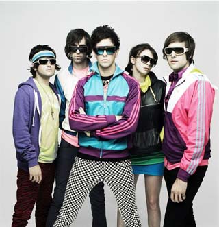
I have found a list of Electro pop/rock Artists who all fit the style of our magazine style.
Lady GaGa
 Songs:
Just Dance
Paparazzi
Boys boys boys
Beautiful dirty rich
Poker face
Starstruck
Ladytron
Songs:
Just Dance
Paparazzi
Boys boys boys
Beautiful dirty rich
Poker face
Starstruck
Ladytron
 Songs:
Seventeen
Open your heart
Sugar
Cobra Starship
Songs:
Seventeen
Open your heart
Sugar
Cobra Starship
 Songs:
Good Girls Go Bad
The City is at War
Cobras never say die
Ke$ha
Songs:
Good Girls Go Bad
The City is at War
Cobras never say die
Ke$ha
 Songs:
Tik Tok
Get in line
Passion Pit
Songs:
Tik Tok
Get in line
Passion Pit
 Songs:
I've got your number
Sleepyhead
Cuddlefuddle
Robyn
Songs:
I've got your number
Sleepyhead
Cuddlefuddle
Robyn
 Songs:
Who's that girl
Where did our love go
Bumpy ride
I wish
Lady Hawke
Songs:
Who's that girl
Where did our love go
Bumpy ride
I wish
Lady Hawke
 Songs:
My Delirium
Dusk til Dawn
Paris is Burning
Empire Of The Sun
Songs:
My Delirium
Dusk til Dawn
Paris is Burning
Empire Of The Sun
 Songs:
We are the people
standing on the shore
Florence and the Machine
Songs:
We are the people
standing on the shore
Florence and the Machine
 Songs:
Rabbit heart
Between two lungs
Dog days are over
My boy builds coffins
Kiss with a fist
My best dress
La Roux
Songs:
Rabbit heart
Between two lungs
Dog days are over
My boy builds coffins
Kiss with a fist
My best dress
La Roux
 Songs:
In for the kill
Quicksand
Bullet proof
Reflections are protection
Royksopp
Songs:
In for the kill
Quicksand
Bullet proof
Reflections are protection
Royksopp
 songs:
Above and beyond
Be free
Arise
Circuit breaker
songs:
Above and beyond
Be free
Arise
Circuit breaker
Songs:
Just Dance
Paparazzi
Boys boys boys
Beautiful dirty rich
Poker face
Starstruck
Ladytron
Songs:
Seventeen
Open your heart
Sugar
Cobra Starship
Songs:
Good Girls Go Bad
The City is at War
Cobras never say die
Ke$ha
Songs:
Tik Tok
Get in line
Passion Pit
Songs:
I've got your number
Sleepyhead
Cuddlefuddle
Robyn
Songs:
Who's that girl
Where did our love go
Bumpy ride
I wish
Lady Hawke
Songs:
My Delirium
Dusk til Dawn
Paris is Burning
Empire Of The Sun
Songs:
We are the people
standing on the shore
Florence and the Machine
Songs:
Rabbit heart
Between two lungs
Dog days are over
My boy builds coffins
Kiss with a fist
My best dress
La Roux
Songs:
In for the kill
Quicksand
Bullet proof
Reflections are protection
Royksopp
songs:
Above and beyond
Be free
Arise
Circuit breaker
Research for Music Magazine
 I have taken a look at some music magazine front covers and thought about the conventions and kind of things that are expected to be found on all different types of music magazines.
This magazine is an example of a music magazine. the layout is effective and it includes different types of music that can cater for everyone.
I have taken a look at some music magazine front covers and thought about the conventions and kind of things that are expected to be found on all different types of music magazines.
This magazine is an example of a music magazine. the layout is effective and it includes different types of music that can cater for everyone.
 Here is an example of a magazine which is more for people that like to listen to rock music. the cover is bold and has pictures and lists of rock bands. This magazine looks quite masculine but is for both boys and girls. This magazine has large, eye catching words and the kicker is big and attracts attention to it.
Music Magazine
We are now making music magazines.
I decided to go for a music magazine which is under the genre of Electro music with various artists and things which relate to Electro as much as possible.
I have taken a few photos in clothes and in the style of Electro artists and started to plan out how i would like my magazine to look.
I then started to think about who i actually wanted to model for my magazine and be the artist that i need to feature in my magazine.
I took some pictures of my sister in bright clothes and edited them myself so they look very bright and eyecatching.
Wednesday, 4 November 2009
School Magzine and Contents page.


I have completed creating my school magazine and contents page.
I Used the usual magazine conventions and made my magazine look as usual as possible.
I wanted my magazine to look effective and be attractive to the audience who are going to see it.
I didn't want my magazine to look plain and boring, so i used various layers to create effects. I decided to make my magazine look edgy and more interesting that most school magazines usually are when you find them. I did this by using imagery and wording to make it successful.
Monday, 12 October 2009
School Magazine
 I have started to create my school magazine front cover, using a photo which i took and different effects and tools on photoshop.
< This is the image i am using on my magazine front cover, i am also using an image i took for an effect for the background.
I have started to create my school magazine front cover, using a photo which i took and different effects and tools on photoshop.
< This is the image i am using on my magazine front cover, i am also using an image i took for an effect for the background.
Photoshopped images

Using photoshop we were trying out ways to make effective images and i then created an image using pictures of celebrity found from the internet.
I used Esmee Denters to create my image.
There is a large background image of her face which i faded so the image on top of half of her body is bolder and stand out on top, giving an interesting effect.
I then added her name on top of the faded image.
The picture i created looks like the kind you would find in a magazine or on a billboard for an advertisement.
Rule of Thirds and Magazine Titles

we have looked at the rule of thirds on magazine front covers and images to find out which way would be more inviting to the readers and viewers of the magazine.
This rule of thirds image looks more interesting and inviting because its to the side, and not dead central. Some of the bee's body and wings are in the central third of the image, and the flower is in the thirds on the right side.
We also looked at the magazine titles, the way they are presented and what kind of font they are in. we analysed them and thought about what they would tell us if we just saw the title and nothing else. We disovered that we can find out quite a bit about the magazine by the way the title is presented.
Wednesday, 30 September 2009
Analysis of Magazine Front Covers.

In the last few lessons we have been analysing magazine front covers, different genres and types of magazines for different audiences.
we have looked at the different aspects of the magazine front covers and what audiences they are trying to target by what is featured in the magazine shown by the straplines and the kicker on the cover.
For example, this magazine is a fashion magazine 'Vogue' it targets an audience of young women who care about their image and fashion.
The main image is of a young, slim, pretty famous woman, which can draw attention to the magazine.
The straplines are mostly about fashion and beauty, and showing the names of the main fashion capitals of the world.
There is no obvious kicker on this front cover but the big bold names of the capitals draw attention just like the kicker would. There is also no pug on this magazine cover but there are quite a few straplines on either side of her face and body.
Subscribe to:
Comments (Atom)